
Drawing / Beginner
Choose Three Colors for a Coloring Page Before Filling Every Shape
Test two small palettes on one flower-and-leaf motif, then carry the clearer choice into a larger coloring page.
Start with a small decision
A detailed coloring page can make every shape feel like a new decision. A small palette reduces that load. For this exercise, choose one color for large repeated areas, one accent and one lighter companion. Three colors are a helpful constraint, not a rule about how art should look.
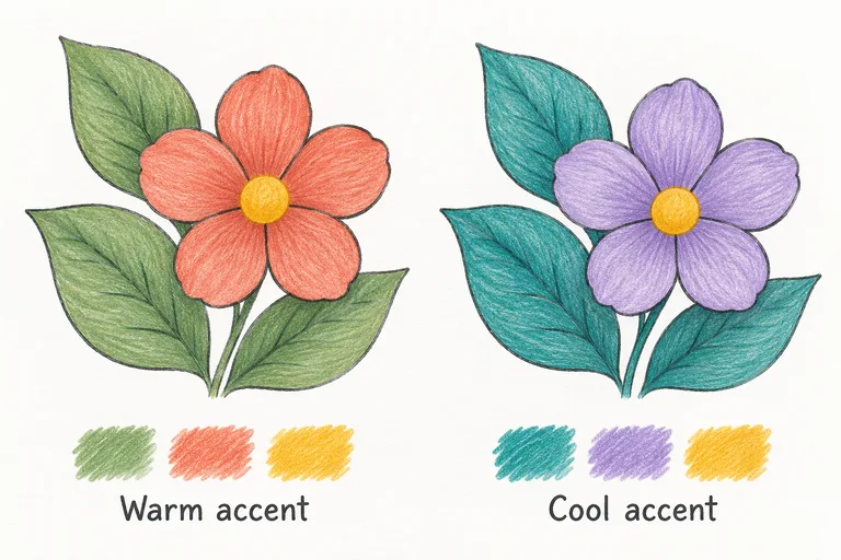
Use colored pencils and a spare copy or small sketch of a broad flower with a few leaves. Test on the same type of paper you will use for the final page. A printer sheet and a textured art paper can accept marks differently.
Make two honest tests
Draw three swatches for the first palette. Try sage, coral and golden yellow if you have similar pencils, or choose your own equivalents. On a second motif, try teal, lavender and the same yellow. Color names here describe the illustrative example; they are not exact brand matches or guaranteed mixtures.
Keep the pressure gentle during the first pass so you can build more color later. Faber-Castell's technique guidance includes light-pressure shading. Use that principle for your tests rather than trying to finish each tiny sample with heavy pressure immediately.
Assign a role to each color
- Main color: repeat it through several related shapes, such as the leaves. This gives the page a visible connection.
- Accent: use it where you want attention, perhaps in the flower petals. Keep its area smaller if it starts to dominate.
- Companion: place it in a few connecting details, such as flower centers. Leave paper showing when that keeps the design calmer.
You can shade with a lighter and stronger application of the same pencil. You do not need another color for every shadow. Test overlapping colors on scrap first; the result depends on the pencils and paper.
Compare clarity, not just favorite colors
Put both motifs beside the larger page. Which palette separates neighboring shapes more clearly? Which repeated color helps your eye move through the design? Which accent is strong enough to notice without taking over? If two colors look too similar, change their value or assign them to areas that do not touch.
Look at the swatches in the light where you normally color. A phone screen can alter the appearance, so use the actual paper comparison to make your choice. Avoid assuming that the digital illustration is a precise color reference.
Move into the page gradually
Begin with a small section of the real page and repeat the role assignments. Pause before completing all the main-color areas: you may discover that the accent needs more breathing room. Keep a quick swatch note so you can return to the project another day.
If the page feels busy, reduce the number of accent areas rather than adding more colors to fix every shape. If it feels flat, strengthen one focal area with another light layer. Stop when the major shapes remain clear and the palette feels intentional to you.
For more on handling the pencils, continue with the colored-pencil layering lesson.