
Coloring / Beginner
Color Wood Grain on a Coloring Page: Shade the Board Before the Lines
Make a wooden shelf, door or box feel solid with a simple value plan and grain marks that respect the direction of each board.
Choose one wooden object
A cottage door, a shelf or a small box is enough for this exercise. Choose a clearly outlined object on a coloring page you are allowed to use. Before adding texture, identify which parts are separate boards and which edges describe a change of plane. Grain and construction are different kinds of information.
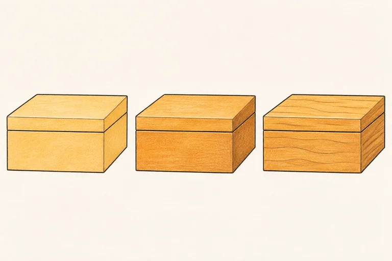
Gather a pale ochre or tan pencil, a warmer middle brown and a darker brown. Exact color names are unimportant. Test them together on spare paper. The image above is a conceptual coloring demonstration, not a claim that the featured box is a page included in the related workbook.
Decide which surfaces face the light
Pick a simple light direction for the scene or follow the direction already suggested by the drawing. Give a front-facing board one broad middle value and a turning side a slightly different value. Leave a pale area where the surface receives more light. Keep these changes subtle enough that the object still reads as wood of one general color.
The value relationships matter before the decorative grain. Cover the tiny printed details briefly and look at the large shape. If a box looks flat, adding a hundred lines will not give its side depth. Adjust the broad color relationship first.
Build a light base with room for texture
Apply the tan or ochre lightly across each board. Work in a direction that is comfortable and avoid forcing the paper grain completely closed. Leave the darkest pencil aside until you have checked the base against neighboring parts of the scene.
Strengthen the appropriate plane with the middle brown. Think in broad areas rather than drawing a dark stripe beside every printed line. A lid, door frame or shelf edge may need a narrow contact accent, but not every board requires the same shadow border.
Let the grain follow each board
Choose a main grain direction for the individual piece of timber. On a long shelf, the marks usually follow its length. On a turned side of a box, they follow that side's visible direction. Stop the marks at seams instead of drawing one pattern across separate surfaces.
Use a few uneven, gently wandering lines. Vary their length and spacing, and let some disappear into the base tone. A repeated row of identical waves can look like patterned fabric. You do not need to copy all the microscopic grain from a photographic reference into a small coloring shape.
Add one optional knot and a few recesses
If there is room, suggest a single small knot with a curved dark center and a few surrounding lines that bend around it. Keep it subordinate to the board. Skip it entirely on a tiny window frame or narrow shelf; an oversized knot can overwhelm the object.
Use selected darker accents beneath an overhang or inside a joint. Keep the texture lighter than the most important construction edges. If the drawing contains cracks, distinguish those from decorative grain by keeping the cracks fewer and more decisive.
Compare texture with the rest of the page
View the scene at normal reading distance. The wooden object should still have a clear silhouette and readable planes. If the grain becomes the loudest part of the scene, simplify it in the next attempt. A smooth painted door may need almost no visible grain at all.
For practice away from a full page, draw three small rectangles on scrap paper and give each a different grain density. Then choose the quietest one that still reads as wood. The hatching lesson can help you compare how mark spacing changes value without pressing harder.