Beginner / Technique studio
Pencil Hatching and Cross-Hatching: Control Value With Lines
Practice pencil hatching and cross-hatching with spacing, direction and selective layers. Build a readable value scale, then shade a simple folded paper form.
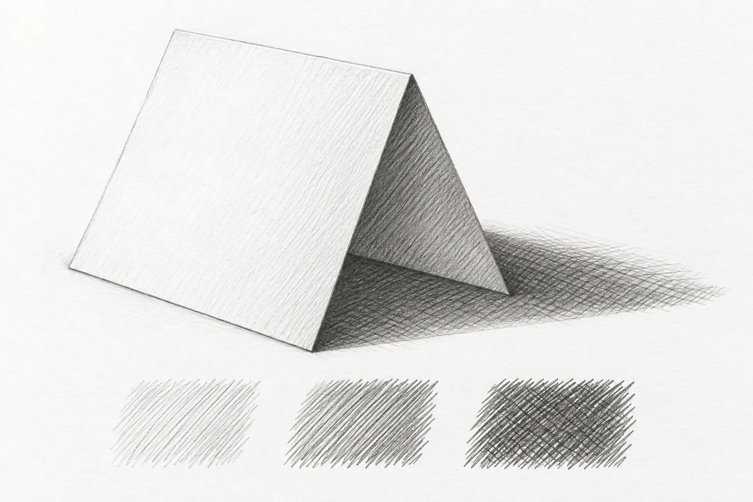
One focused technique study.
Keep the first attempt small enough to repeat. Your own subject, paper and materials are the reference.
- Level
- Beginner
- Practice time
- 20–30 minutes
- Skill focus
- Line spacing, directional layers and clear value groups
- Success looks like
- Make three distinct values with visible pencil strokes and apply them to a simple folded-paper study.
Materials
- Drawing paper and an HB or 2B pencil
- Sharpener and eraser
- Scrap paper for line tests
- A plain piece of paper folded into a standing tent and one side light
Make three distinct values with visible pencil strokes and apply them to a simple folded-paper study.
Distinguish hatching from a dark outline
Hatching uses groups of neighboring strokes to create tone. Cross-hatching adds another group at a different angle. The lines are not merely decoration inside an outline: their spacing and layering should help separate light from dark. For this exercise, keep the strokes visible instead of blending them into a smooth gray patch.
Start with one familiar pencil rather than a large set. Make short parallel strokes on scrap and compare the spaces between them. A sharp point helps you see separate marks, but pressing hard is not the aim. Choose a stroke length you can repeat comfortably without hooking every end or cutting a groove into the sheet.
Build three values by changing spacing
Lightly mark three neighboring rectangles. In the first, leave most of the paper visible between lines. In the second, place the strokes closer together while keeping pressure similar. In the third, start with the same closer spacing and leave room for another directional layer. Check from arm's length before adding that layer.
Do the first two rectangles already separate into light and middle values? If not, change the spacing rather than simply pressing harder everywhere. Keep the boundaries quiet: a thick box outline can dominate a delicate value exercise. Uneven marks are normal at first; compare small groups and make the next group more deliberate.
Add a second direction only where it helps
In the third rectangle, place another set of light strokes across the first at a clearly different angle. Aim for a darker overall value, not a perfectly regular woven grid. Stop and compare all three rectangles. The darkest sample should still contain some visible paper and distinct strokes rather than an embossed, polished surface.
Try a second three-value strip with a different crossing angle. Compare which combination is easier to control with your hand and paper. There is no single required angle for every subject. What matters here is that the extra layer changes the value without making the light and middle samples equally busy. Leave the first strip beside the second as evidence.
Set up a folded-paper subject with simple planes
Fold a plain sheet into a small standing tent and place it on a table under one side light. Choose a view where you can see both sloping planes and part of the cast shadow. Sketch the outside shape and central fold lightly. Check the angles and width before shading; dense line work will not correct a distorted construction.
Squint and decide which plane is lighter, which is a middle value and where the darker cast shadow sits. Your actual setup decides the order. Do not automatically darken the left or right plane because a diagram says so. Compare the three groups with your practice strip and choose a restrained line pattern for each.
Use line groups to preserve the planes
Place the first hatching lightly on the middle-value plane, keeping the strokes within its boundary. Leave the lighter plane mostly quiet or use much wider spacing if it needs tone. Change stroke direction thoughtfully when moving to another plane. The fold should become understandable through value and direction, not just a heavy central line.
Add a second directional layer only to selected darker passages, such as the cast shadow or a shadowed plane in your setup. Compare the whole subject after each group. Do not make every surface cross-hatched merely to show the technique. A simple light shape beside an active darker shape can explain the form more clearly than uniform detail.
Repeat without blending away the evidence
Make a second thumbnail of the same setup in five minutes. Use only one hatching direction on the middle group and a second direction in the dark group. Keep the light group sparse. Compare the thumbnail with the longer study: can you still identify the fold and the cast shadow when the drawings are small?
If all values merge, change spacing before adding another layer. If the sheet looks scratched, reduce pressure and try shorter groups on scrap. If the form is unclear, check the underlying angles rather than covering them with texture. Keep one successful strip beside the drawing so you can reuse that value relationship in another subject.
Change one decision, not everything.
Common mistakes
Every area becomes equally dark
Reserve a quieter light group and layer only selected darker passages.
The paper looks scratched
Reduce pressure and test shorter, lighter strokes on scrap.
Cross-hatching turns into a rigid grid
Use controlled groups without forcing every intersection to match.
Blending hides the line practice
Leave strokes visible while learning how spacing changes value.
Think it through
Try answering these questions in your own words, then open each answer to compare. Use the self-check below to review your actual study.
How can spacing create different values?
Lightly mark three neighboring rectangles. In the first, leave most of the paper visible between lines. In the second, place the strokes closer together while keeping pressure similar. In the third, start with the same closer spacing and leave room for another directional layer. Check from arm's length before adding that layer.
Practice step: Build three values by changing spacing
Where should the second line direction be added?
In the third rectangle, place another set of light strokes across the first at a clearly different angle. Aim for a darker overall value, not a perfectly regular woven grid. Stop and compare all three rectangles. The darkest sample should still contain some visible paper and distinct strokes rather than an embossed, polished surface.
Practice step: Add a second direction only where it helps
Review your own study
Tick what you can observe in your work. If a point is unclear, open its practice reminder. Choose one point to focus on next.
Tick a point only when you can observe it in your study.
Choose one focus for your next attempt using the circle beside a point.
This is your own reflection, not an assessment of your artwork. Choices are not saved or uploaded and reset when this page reloads.
Further learning and source context
This is an original LUREXEN exercise. These manufacturer education pages support general material, value or perspective decisions; they do not document the exact study pictured above. No publisher artwork was reused.