
Beginner / Graphite workshop
Pencil Shading for Beginners: Values, Pressure & Form
Good pencil shading is not simply smooth shading. Learn to organize light and shadow, control pressure, and choose dark accents so a simple object reads clearly before you blend or add texture.
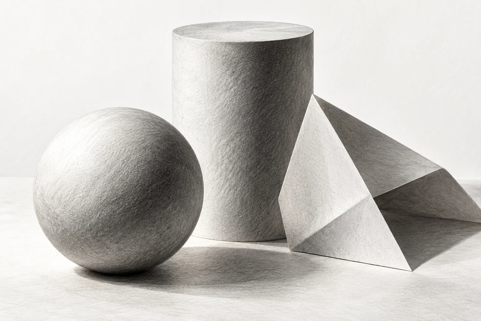
Make a usable five-value scale and apply three broad value groups to a simple form.
Set up a form with readable light
Choose a plain ball, unpatterned cup, or simple folded paper form. Use one main light source and keep the object still. Begin with drawing paper, one graphite pencil, an eraser, and a spare margin for tests. Multiple pencil grades can expand your options, but they are not required for this lesson.
Observe the broad lit area and shadow area before reflections or surface marks. Check the outline with a light construction sketch. If the proportions are wrong, correct them now. Rendering an inaccurate shape beautifully makes it harder to change later without improving the underlying drawing.
Make a scale you can actually use
Draw five boxes. Leave the first mostly as paper and make the last your darkest comfortable value without damaging the surface. Build three distinguishable steps between them. Judge each box against its neighbors instead of trying to match an exact numerical percentage.
Start each box lightly and add overlapping passes with consistent pressure. If a patch becomes striped, use a broader light pass rather than pressing hard into every gap. Keep this scale beside the form study. Its purpose is to help choose relationships while drawing, not to produce a perfectly decorative row that you never consult again.
Compare pressure with layering
Make one strip by gradually increasing pressure. Make a second by building several light layers. Compare the darkness, surface texture, and ease of adjustment. Strong pressure may indent the paper or make graphite difficult to lift, so reserve it rather than using it as your first route to every dark.
Try the side of the pencil for broader passages and the point for controlled accents. Neither grip is mandatory. Choose what gives you a stable mark at your drawing size. Avoid switching between heavy and light strokes randomly within a region that should read as one consistent value group.
Separate the form into broad groups
Use light, middle, and dark families first. Establish the shadow as a connected shape and keep the main light passage quiet. Then add the middle region that helps describe the surface turning. Compare these groups with your scale rather than shading each small patch independently.
The object may not follow a textbook sphere pattern. Reflective surfaces, nearby objects, and changing illumination can complicate the arrangement. Follow the observed relationships. Reflected light within a shadow does not automatically mean it should become as bright as the main lit area. Compare it directly before erasing a large highlight into the shadow.
Distinguish form shadow from cast shadow
The form shadow belongs to the object's surface. The cast shadow falls onto another surface. Compare their shapes, values, and edges separately. Add the broad cast-shadow shape in the direction supported by the light, connecting it to the object where they meet.
A contact accent can help ground the object, but a thick black ring around its base may look artificial. Check the reference before emphasizing it. If the drawing looks flat, view it small: similar light and shadow groups or a misplaced dark accent may be the issue. Adding texture will not necessarily solve that structure.
Run a focused shading test
Make two small drawings of the same form. In the first, use only three clear values and no blending. In the second, keep those groups but soften a few transitions. Compare whether smoother handling actually improves the sense of volume or merely hides the grouping.
If shading is patchy, compare pressure and stroke density inside one group. If volume is weak, compare the groups themselves. Choose the correction matching the problem. Move the light for another study only after this comparison is clear. Next, combine shading with construction in the cup drawing lesson, keeping the scale available as a working reference.
A useful next lesson
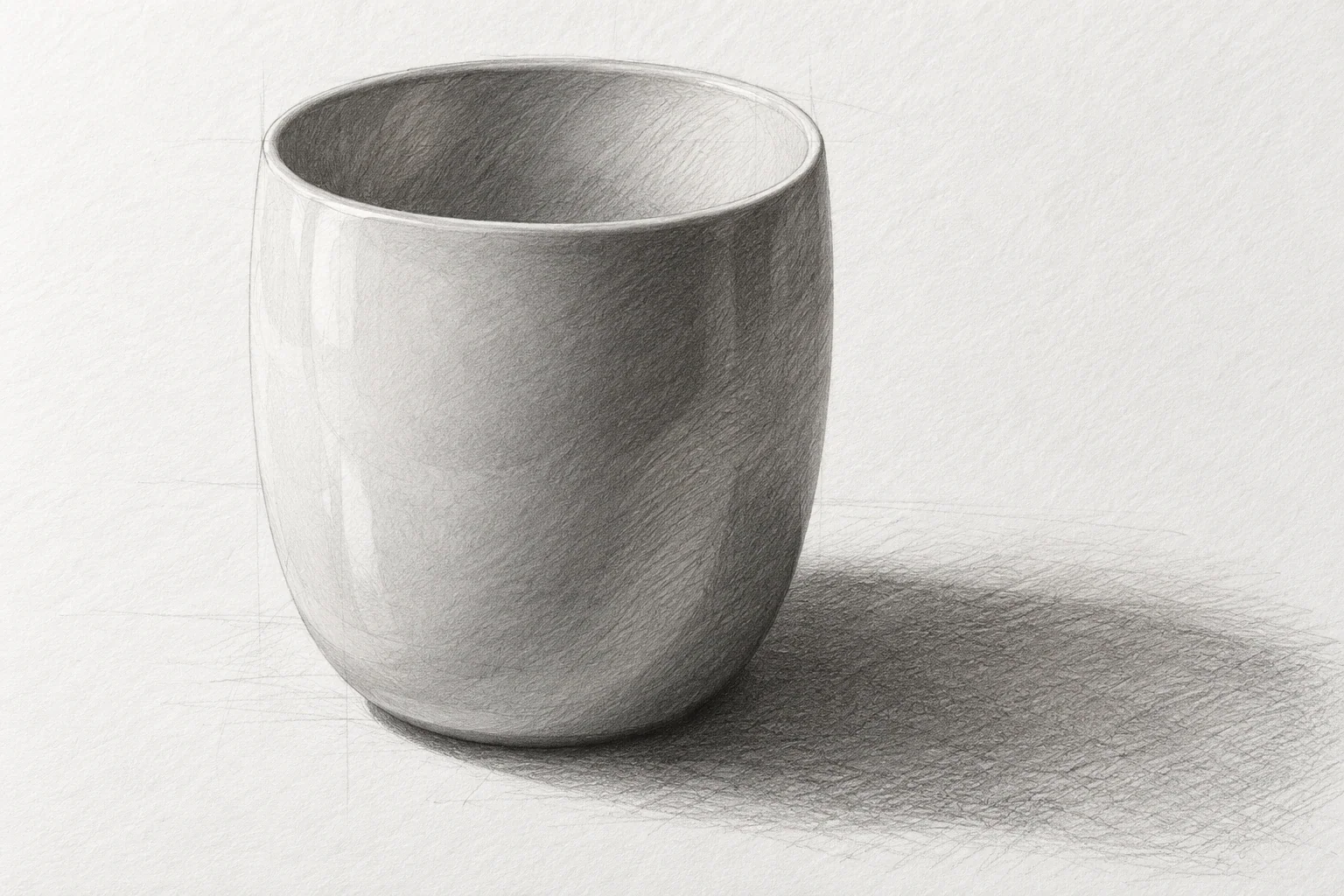
How to Draw a Cup: Proportion, Ellipses & Pencil Shading
A cup is a compact lesson in proportion, ellipses, and value. Work in an order that makes corrections inexpensive: establish the body, check the opening and handle, then add enough shading to explain the form.
3 min read Read the lesson →
One-Point Perspective for Beginners: Draw a Simple Room
Construct a simple room to learn what one-point perspective controls—and what it does not. You will separate front-facing edges from depth edges, place one box, and check convergence before decorating the scene.
3 min read Read the lesson →