Beginner / Studio practice
Drawing on Toned Paper: Let the Midtone Do the Work
Draw a simple pear on toned paper using a dark pencil and restrained white highlights. Preserve the paper tone instead of filling every surface.
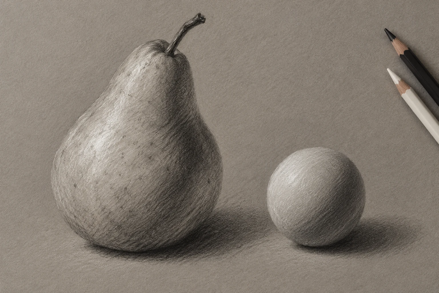
One focused, repeatable study.
Keep the first attempt small enough to repeat. Your own subject, paper and materials are the reference.
- Level
- Beginner
- Practice time
- 30–40 minutes
- Skill focus
- Paper midtone, dark shapes and selective white marks
- Success looks like
- Make a small study with clearly distinguishable dark marks, untouched paper and added light.
Materials
- Midtone gray or tan drawing paper with a matching test scrap
- A dark drawing pencil and a white drawing pencil suitable for the paper
- A kneaded eraser and a clean sheet to rest the hand on
- A pear or a simple matte object under steady side light
Make a small study with clearly distinguishable dark marks, untouched paper and added light.
Start with a paper tone you can use
A midtone sheet gives you a value between your darkest and lightest marks before drawing begins. The Strathmore description linked below explains working toward both light and dark from that starting tone. This exercise applies that principle to one small object.
Choose a medium gray or tan rather than the darkest sheet available. On an offcut, place one light dark-pencil patch and one white-pencil patch with a strip of untouched paper between them. Check that all three read distinctly. A white pencil that barely shows on your paper is a material issue to test before the main study.
Set a simple object and a stable light
Place a pear or another matte object where one light-facing side and one shadow side are visible. Keep the setup and your seat still. Make a small drawing so you can compare the whole shape without being pulled immediately into surface detail.
Mark the overall height, width and main direction lightly. Check an asymmetric pear as an asymmetric shape; do not tidy it into a standard pear symbol. Select a broad middle-value passage that will stay as paper. That reserved area is an active part of the drawing, not an unfinished gap.
Place the dark group without outlining everything
Locate the largest connected shadow passage. Build it with light layers and compare its boundary with the subject. Some turns are gradual; an overlap or contact may be more definite. Leave the light-facing passage and chosen midtone area mostly untouched.
Add a modest cast shadow to establish where the object rests. Keep checking whether it is actually darker than the form shadow in your setup. Do not surround the whole object with a heavy contour just because its silhouette feels uncertain. Recheck the proportion first, then use selected edges.
Add white only where observation calls for it
Use the white pencil on a limited light-facing passage. Start gently so the first mark can be judged before you build it. Preserve some of the nearby paper tone, making a visible transition between added white and the midtone sheet.
Keep the strongest white for the lightest observed area rather than tracing every outer edge. A matte pear does not need a chain of bright dots to look dimensional. If the white crosses an existing dark patch, test the interaction on scrap instead of repeatedly rubbing the two materials together on the drawing.
Compare three value families at a distance
Hold the drawing away from you. Identify the dark group, the exposed paper and the white passage without naming them aloud. If the whole surface looks chalky, make a second small study with less white rather than covering it again to search for more contrast.
If the object looks flat, compare the placement and size of the value groups with the subject. More intense black and white cannot fix a misplaced light boundary. A kneaded eraser may lift some dark medium, but the result depends on the material; it does not turn a colored sheet into white paper.
Repeat with a smaller highlight shape
Draw the same object again, changing only how much white you use. Keep a note of which version leaves more paper tone visible and whether that improves the sense of form. Do not assume that a larger range of marks always makes the clearer drawing.
The useful result is a deliberate relationship between the sheet and the two media. Keep the scrap tests alongside the studies so future choices are based on what you observed. Continue with value massing to simplify a more complex still life before trying detailed textures or portraits.
Change one decision, not everything.
Common mistakes
The paper is covered as if it were white
Plan an untouched midtone passage before shading.
White becomes a decorative outline
Confine it to the light-facing shapes you observe.
Strong black and white are used to fix a wrong shape
Recheck proportion and value placement first.
Think it through
Try answering these questions in your own words, then open each answer to compare. Use the self-check below to review your actual study.
What role does the untouched paper tone play?
Plan an untouched midtone passage before shading.
Practice step: The paper is covered as if it were white
Where should I use the white pencil?
Use the white pencil on a limited light-facing passage. Start gently so the first mark can be judged before you build it. Preserve some of the nearby paper tone, making a visible transition between added white and the midtone sheet.
Practice step: Add white only where observation calls for it
Review your own study
Tick what you can observe in your work. If a point is unclear, open its practice reminder. Choose one point to focus on next.
Tick a point only when you can observe it in your study.
Choose one focus for your next attempt using the circle beside a point.
This is your own reflection, not an assessment of your artwork. Choices are not saved or uploaded and reset when this page reloads.
Further learning and source context
This is an original LUREXEN exercise. The sources below provide material or concept context; they do not document the exact study pictured above. No publisher artwork was reused.
- Strathmore Artist Papers / Stephen Cefalo: Drawing on Toned Paper ↗ — Official channel description supports working with light and dark media from the paper midtone. The video was not reproduced; the pear exercise is original.