
Coloring / Beginner
Color Skin Tones with Pencils: Test Three Small Mixtures First
Compare a light, middle and shadow mixture on your actual paper before coloring a face, keeping each lighter area related to its local skin color.
Choose a reference instead of one universal formula
A pencil labelled “skin” cannot represent every person or every lighting condition. Start with one reference you are permitted to use and look at its broad color and value relationships. The goal of this exercise is a useful small mixture record, not a complete portrait.
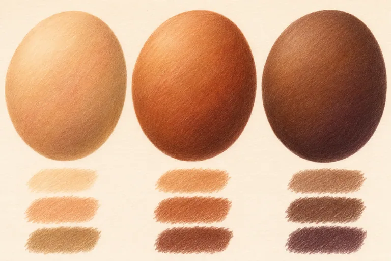
Use the same paper as your intended coloring page, several colored pencils and a sharpener. Choose possible light, middle and shadow colors from the pencils you own. Warm ochres, reds, browns and muted cooler colors can be candidates, but your reference determines which ones are useful. The image above is an AI-generated illustration, not a tested brand-specific recipe.
Make three small mixture trials
Draw three modest test areas on a spare sheet. Keep their size and your initial pencil pressure similar. In the first, try the simplest combination that seems close to the reference. In the second, change one color toward a warmer mixture. In the third, test a slightly cooler or more muted version.
Keep the rest of the procedure consistent so the comparison tells you something. If you change the paper, pressure and every pencil at once, it becomes harder to identify why one result works better. The three large ovals in the illustration represent different example color families, not three required versions of the same person's skin.
Build the middle color with gentle layers
Apply a light first layer rather than pressing for a finished surface immediately. Add a second color gradually and observe how it modifies the first. Faber-Castell's basic coloring guidance describes light-pressure shading and overlapping color layers; the exact result still depends on your pencil and paper.
Keep a little paper texture available while adjusting the mixture. If you press hard too early, later corrections may become more difficult. Test a small increase in pressure on scrap paper before using it on the face itself.
Keep the light related to the local color
In a small oval beside the chosen mixture, reserve a lighter area and gradually deepen the opposite side. On a deep-brown study, the light can remain a lighter brown. It does not automatically need to become pale peach or white.
Likewise, avoid making every shadow black. Try a darker or more muted mixture related to the observed skin color. A cooler note may help in some lighting, but a blue or purple stripe added by habit can look disconnected from the form.
Transfer the decision to a small face area
Choose one cheek or forehead area on your own drawing or a suitable coloring page. Establish its light and middle values before adding a few shadow changes. Keep transitions broad and gentle instead of outlining every facial feature with the darkest pencil.
Printed linework affects the finished appearance. Bold outlines will remain visible, and different paper may accept fewer layers than your test sheet. If the page begins to look patchy, stop and compare a fresh small trial before repeatedly covering the entire area.
Record what worked on your materials
Write the actual pencil names or numbers beside the trial, in the order you used them. Note whether the mixture was too orange, too gray, too light or close enough for the reference. A short specific observation is more reusable than a promise that one recipe works for all skin.
For more help with the layering stage, read the light-layer pencil exercise. The related Portrait Drawing workbook concerns graphite construction and portrait practice; it is not a colored-pencil skin-recipe course, and these swatches are not advertised as pages inside it.