Watercolor / Intermediate
Watercolor Night Scenes: Test Your Darks Before Painting the Sky
Make a compact dry-swatch comparison to choose a night mixture, preserve warm windows and avoid adjusting every shadow in the painting.
A dark color name is not a value plan
A paint called indigo, midnight or neutral tint may behave differently from another brand's color with a similar name. Start with the paint you own. The useful question is whether its dry wash gives the value and color variation you want beside a small light window.
This lesson is not a claim that black pigment is wrong. A ready-made dark can be practical. A mixed dark can also be useful. Compare their behavior rather than treating one option as automatically more artistic.
Make a two-by-three comparison
Use the same watercolor paper you intend to paint on. Choose a blue you know and an optional second color to alter its character. On scrap, make three related mixtures or use three existing dark paints. Paint each in a stronger wash and a more diluted wash. Label them in your own notes with the actual paint names or pigment codes.
Manufacturer pigment charts, such as Winsor & Newton's, distinguish characteristics including transparency and staining. They help describe a specific paint; they do not guarantee how your mixture will look on another paper.
Compare the dry result beside a light
- Let the chart dry. Judge the result when the surface has settled, not while every patch shines with water.
- Add a separate pale window swatch. Place a small warm shape beside the test chart, leaving a paper gap. Compare it against each dry dark.
- Choose the job for the mixture. A sky may need a broad quiet wash, while a roofline needs a firmer edge. The same pigment can be diluted differently for each role.
- Record the choice. Keep a note of the paints, paper and approximate appearance of the puddle. Avoid presenting brush-load estimates as a universal recipe.
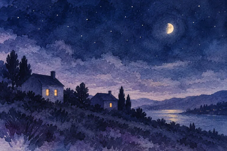
Paint a small two-house study
Sketch two simple roof shapes and reserve only a couple of windows. Place a quieter sky wash first and let it dry before adding the houses where a distinct roof edge is important. Group most of each house into one shadow family. Add a slightly different dark only where it explains a roof overlap or a doorway.
Do not chase a luminous window by outlining it repeatedly. Keep the light shape clean, then decide whether its immediate surroundings need a small darker accent. The amount of contrast matters more than adding a bright yellow everywhere.
Read the result at a distance
If the sky and houses merge into a single slab, compare their dry values or edge treatment. If every wall is a different dramatic color, group them more simply in the next thumbnail. If the light windows dominate too strongly, reduce their size rather than automatically darkening the whole painting.
Keep a reusable night note
Save the chart with the study. On your next night painting, test one changed condition—another paper, a different dilution or a new neighboring warm color. Treat it as a comparison, not proof that one paint will work for every scene. Your own dry samples are more useful than trying to match an image on a backlit screen.