
Beginner / Intermediate / Composition workshop
Creating Depth in Watercolor Landscapes
A landscape can look flat even when its individual trees and mountains are carefully painted. This guide shows how to organize depth through overlap, value, edges, and a focal area before investing time in detail.
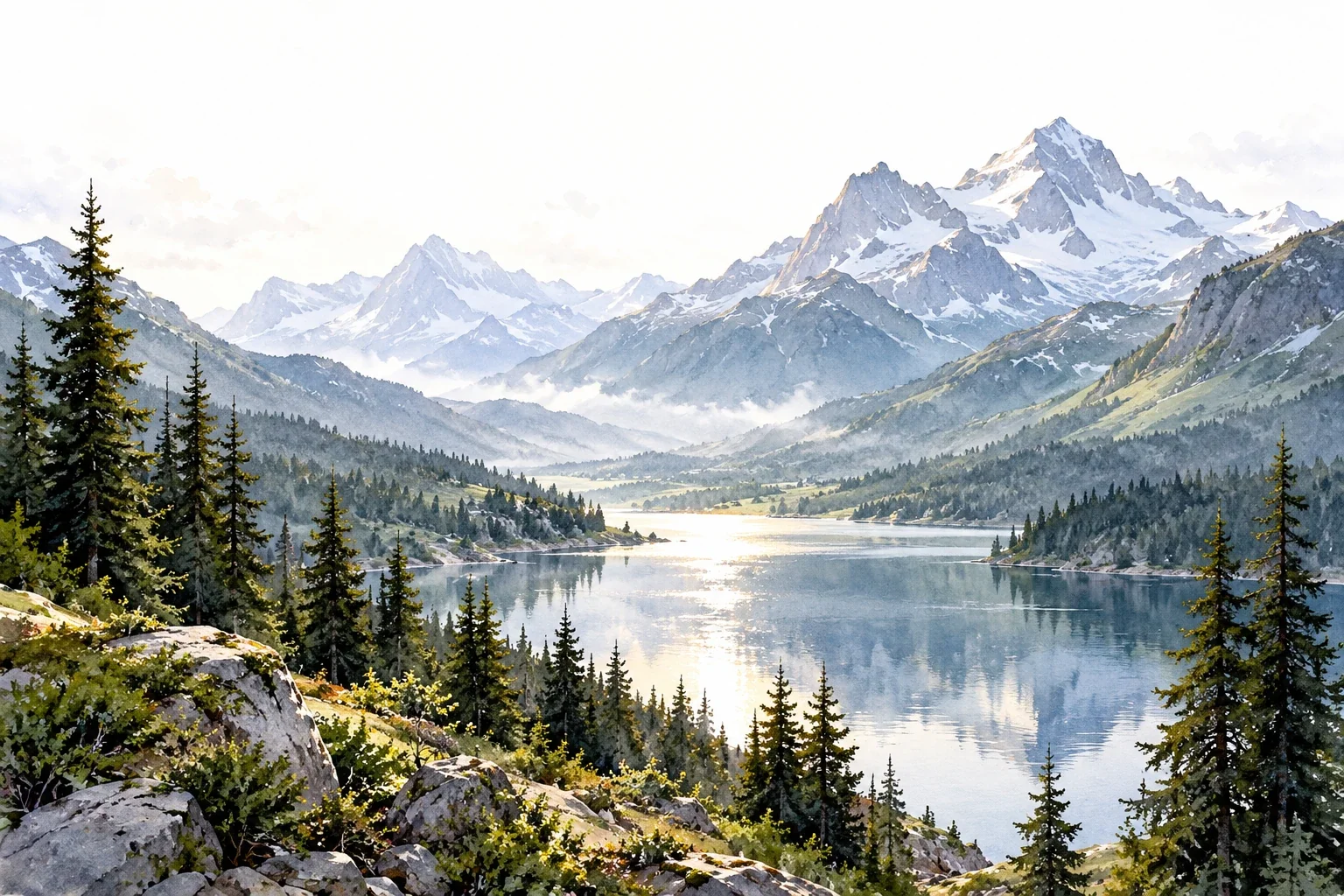
Plan and paint a small landscape whose foreground, middle ground, and distance read as distinct zones.
Choose a scene with readable layers
Begin with a reference you have permission to use, or a view you can observe directly. Choose three easy-to-separate zones: perhaps foreground grass, a middle-ground lake, and distant hills. Avoid a scene crowded with buildings and tiny branches for this first exercise. A postcard-sized study is enough.
Use watercolor paper, a comfortable brush, a pencil, and two or three paints already on your palette. You do not need to match every local color. Start by asking which shapes overlap and where the strongest light-to-dark difference occurs. Those relationships will carry more depth than precise tree texture.
Make a three-value thumbnail
Draw a small rectangle and reduce the view to light, middle, and dark shapes. Keep each shape broad. A dark tree group is one mass at this stage, not twenty individual trees. Decide which value occupies the most space and where your main light shape will remain.
Check the thumbnail from arm's length. If everything forms equally sized patches, join related shapes or simplify an unimportant area. Mark a focal area, such as a sunlit shore against darker trees. It should receive a clear visual emphasis, not necessarily sit in the center. Plan white paper before paint makes that decision harder.
Use more than one depth cue
Overlap establishes which shape sits in front. Relative size can support distance when you compare similar objects. Edge and contrast changes can separate zones: quieter distant shapes and a few stronger foreground accents are useful starting points, but not universal rules.
A backlit mountain may be dark against a bright sky, so do not automatically make every distant shape pale blue. Follow the reference. If value alone does not separate two zones, consider their overlap, scale, or edge treatment. This gives you alternatives to repeatedly darkening the foreground until it overwhelms the picture.
Paint from broad passages to selected accents
Establish the sky and lightest distant shapes first, preserving your planned light areas. Use wet-on-wet only where you want softer boundaries; use dry paper where a clearer silhouette matters. Allow a passage to dry before adding an adjacent shape whose edge needs to stay distinct.
Add middle-ground masses without describing every object. Finally, introduce a few foreground darks or sharper edges. Compare each new accent with the thumbnail. If it pulls attention away from your focal area, reduce its importance in the next study. Detail should reinforce the larger arrangement, not create a second competing composition.
Repair the structure before adding texture
View the study small. Can you identify the three zones without reading the subject as trees or mountains? If not, locate the specific relationship causing confusion. Two adjacent hills might need clearer overlap; distant trees might have the same contrast and sharpness as the foreground.
- Everything competes: simplify one zone and reserve the strongest accent for the focal area.
- Distance feels pasted on: compare its contrast and edge strength with nearby shapes.
- The picture is busy: redraw the thumbnail with fewer connected masses before repainting.
Do not assume a weak structure can be solved with extra foliage marks.
Test depth with two small versions
Repeat the same outline twice. Keep the palette and focal area consistent. In the first version, use similar edge sharpness throughout. In the second, quiet the distance and select a few sharper foreground accents. Compare the dry paintings from the same viewing distance.
Note whether the second version feels deeper and whether its choices still fit the reference. If not, test overlap or relative size instead. The exercise is about choosing a useful cue, not obeying a formula. Next, use the mixing workshop to find restrained colors for distance. A clear three-zone study is a stronger foundation than a highly detailed but unreadable scene.
A useful next lesson
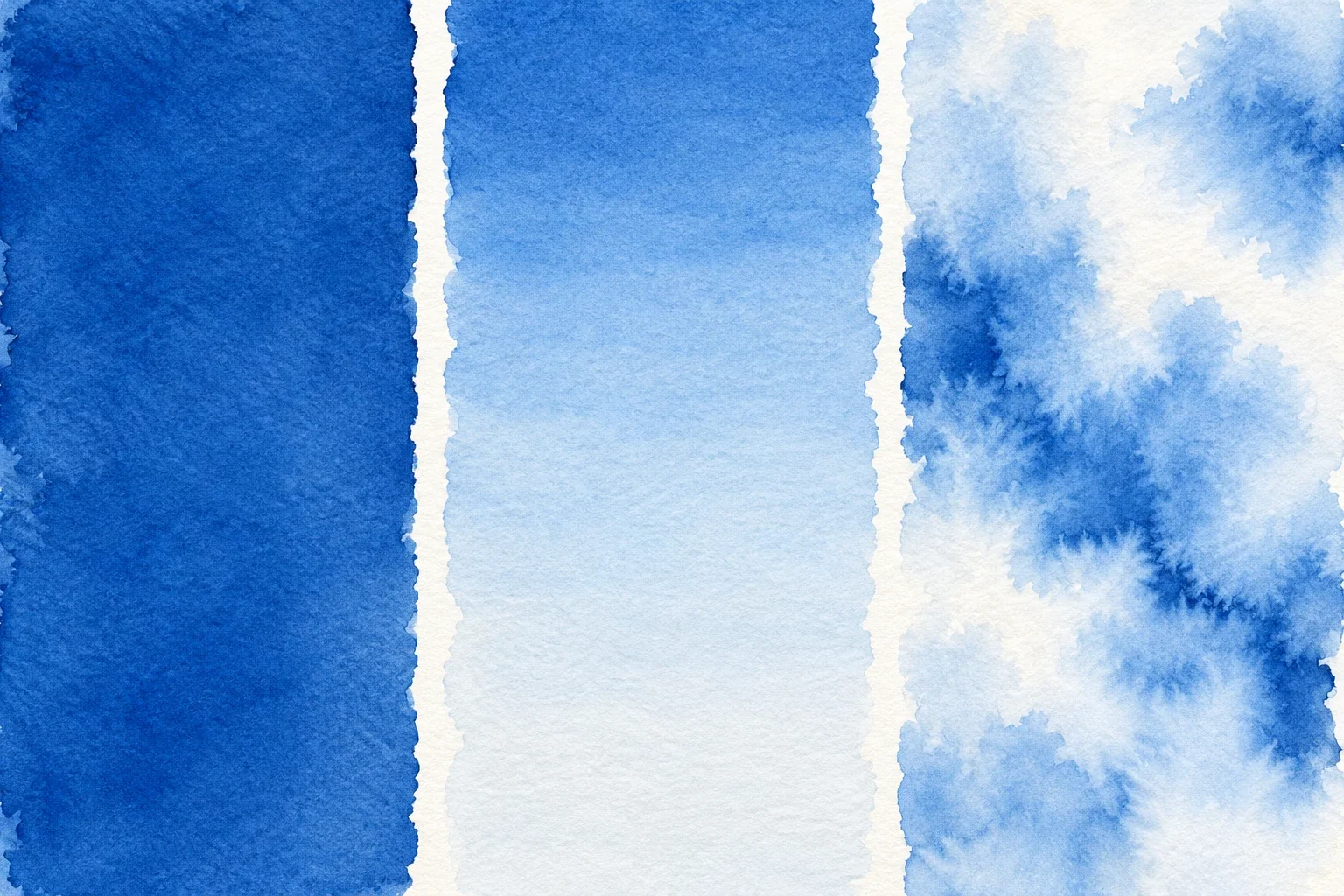
Watercolor Washes for Beginners: Flat, Graded & Wet-on-Wet
A wash succeeds when your brush load, paint supply, and paper moisture work together. Make three small tests to learn when to connect strokes, when to dilute the mixture, and when to let damp paper move the color.
4 min read Read the lesson →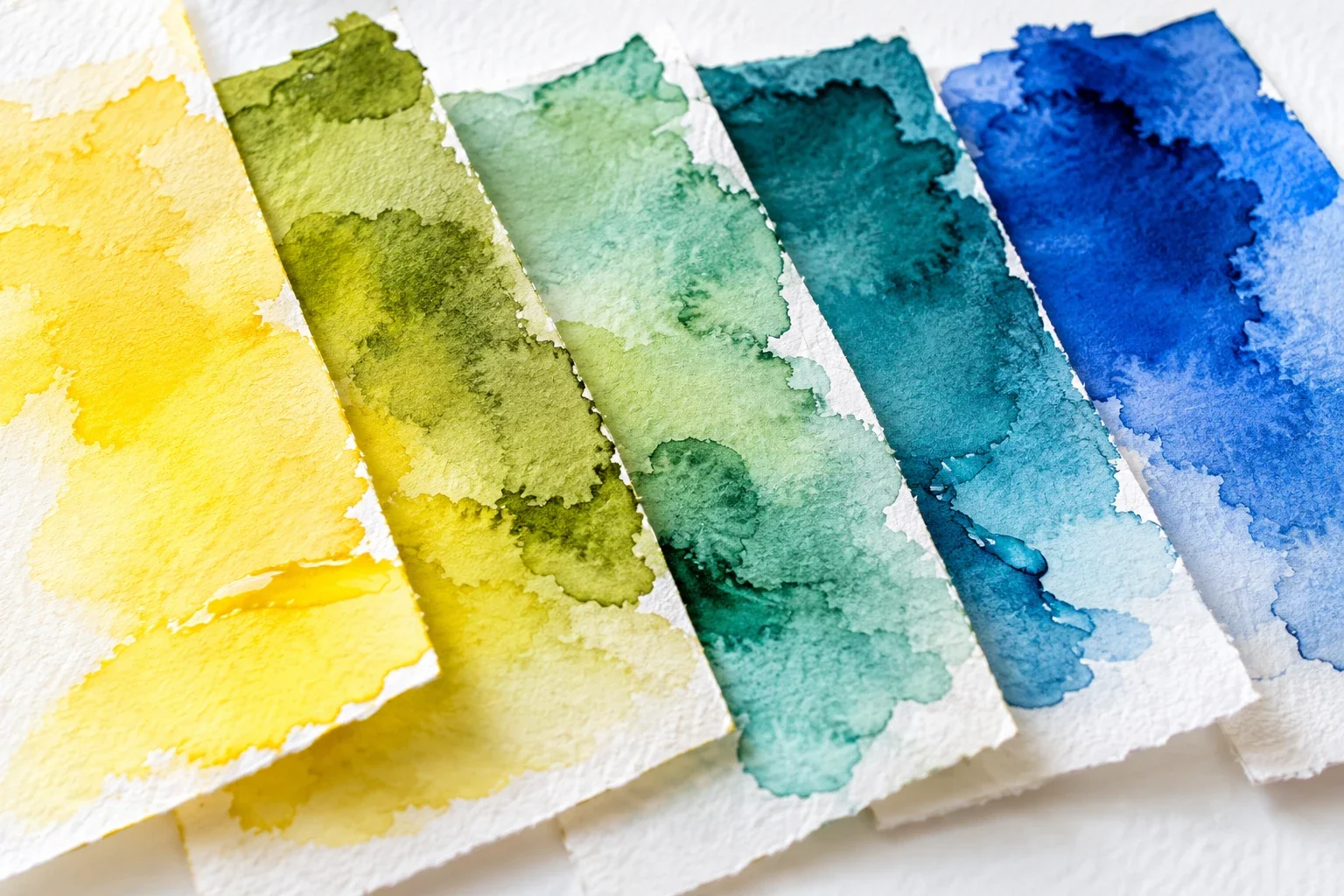
How to Mix Watercolor Colors Without Losing Clarity
When a watercolor mixture disappoints, adding another color is not always the answer. Learn to distinguish hue, value, and saturation, then build a small mixing record that helps you make a specific correction.
4 min read Read the lesson →