
Beginner / Color workshop
How to Mix Watercolor Colors Without Losing Clarity
When a watercolor mixture disappoints, adding another color is not always the answer. Learn to distinguish hue, value, and saturation, then build a small mixing record that helps you make a specific correction.
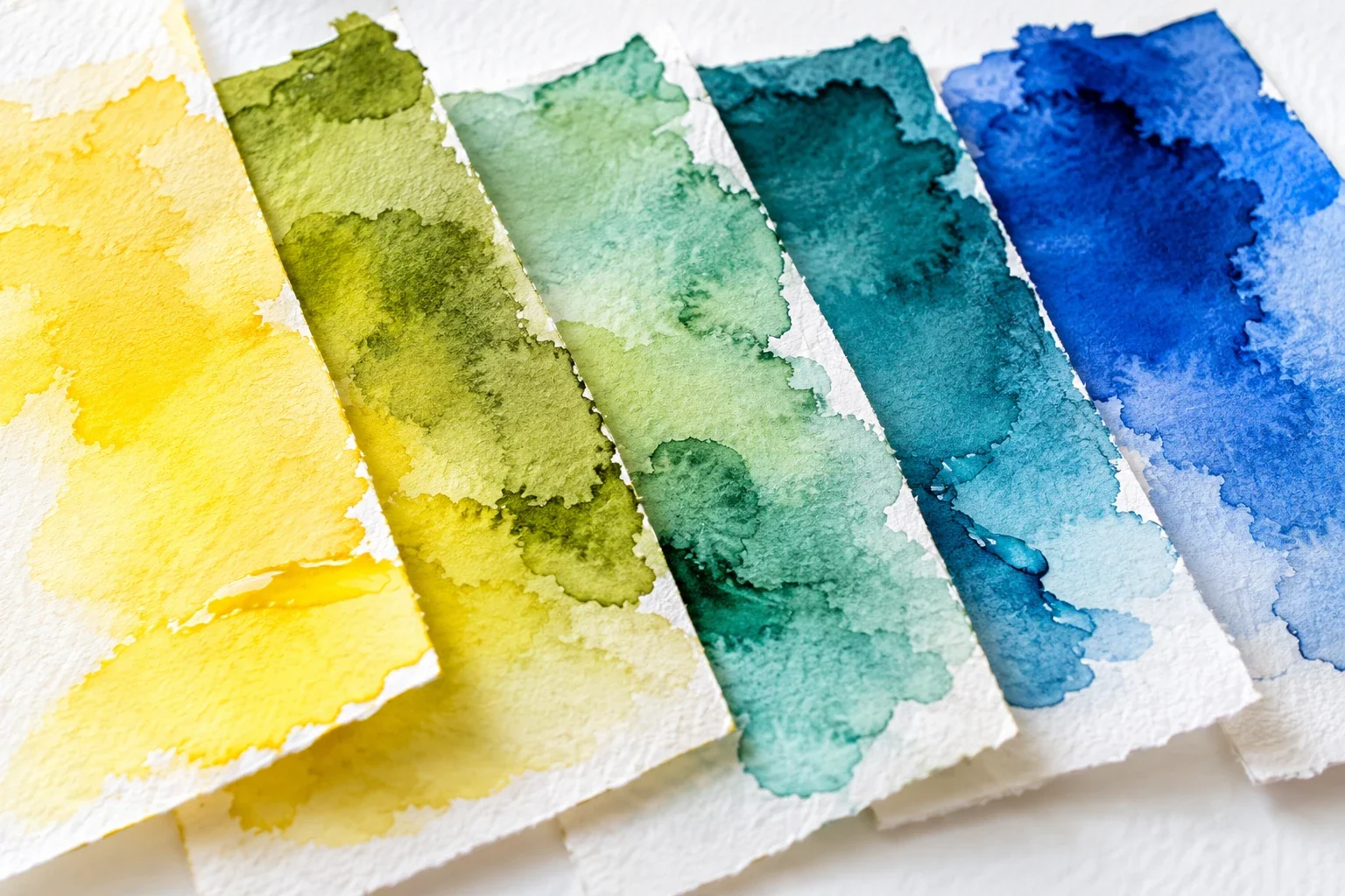
Make a two-color mixing strip and diagnose whether a mixture needs dilution, a hue shift, or reduced intensity.
Choose two paints and record them
Start with one yellow and one blue from your existing palette. Write their names beside the study; if the labels provide pigment codes, record those too. A paint name is not a guarantee that every manufacturer's version has the same ingredients or mixing behavior.
Use watercolor paper, a brush, a clean palette, rinse water, and a separate clean-water supply if practical. Paint each color alone before mixing. Those endpoint swatches help you recognize contamination and show what each paint contributes. Keep the swatches at a useful size rather than turning the first exercise into a large decorative chart.
Build a strip that reveals the relationship
Prepare a small puddle of each paint. Begin with yellow alone, then introduce a little blue for the next swatch. Continue changing the balance through several mixtures, ending with blue alone. Clean the brush when moving between paints so your original puddles remain recognizable.
The steps need not look equally spaced on the first attempt. A stronger-tinting paint may change the mixture with a very small addition. Work gradually and label useful combinations after they dry. Keep the brush load reasonably consistent: otherwise a large change in dilution can disguise what changing the paint ratio actually did.
Identify the problem before changing ingredients
Hue is the color family. A green may lean too yellow or too blue. Value is its lightness or darkness. Saturation is its intensity: vivid and quiet greens can belong to a similar hue family. These are three different questions, even when they appear together in one mixture.
Say “this green is too dark” before saying “this green is wrong.” Make two test swatches: one diluted with clean water and one with a changed paint ratio. Compare them dry. The first tests value; the second tests a hue change. This small separation prevents random additions from obscuring the original problem.
Make a quieter color deliberately
A quiet mixture is not automatically a failed mixture. It may suit a shadow, muted foliage, or distant landscape. When you want to reduce intensity, test a tiny addition of an opposing color on the palette before altering the whole puddle. Observe the result: pigment combinations behave differently, and a useful muted green can become a heavy neutral with too much addition.
Keep both the original and altered swatch. Label what you added and why. If you need a clear bright wash instead, begin with cleaner ingredients and fewer unrecorded additions. Do not make a muted mixture and then expect dilution alone to restore the original vividness.
Troubleshoot the actual mixing conditions
If pale mixtures unexpectedly change, rinse and blot the brush, replace dirty water, and inspect the palette well. A trace of another paint can noticeably alter a light wash. Test the unmixed colors again before blaming your choice of yellow and blue.
If the mixture looks good wet but unsuitable dry, use the dry swatch as your reference. Surface texture and pigment distribution can affect what you see. If several attempts seem inconsistent, repeat with the same paper and similar water load. You are building a record of your materials, not a universal recipe that must work identically for everyone.
Use one mixture in a small painting
Choose three greens from the strip: a light passage, a middle color, and a darker accent. Paint a simple leaf using those roles. When a passage does not fit, identify its hue, value, or intensity before changing it. The goal is a justified decision, not an exact photographic color match.
Keep the strip beside the study and mark the combination worth repeating. A useful note might read “more blue for the cooler shadow; dilution preserved the hue for the light area.” Next, try the watercolor leaf exercise or the landscape depth guide, where restrained color serves a different purpose.
A useful next lesson
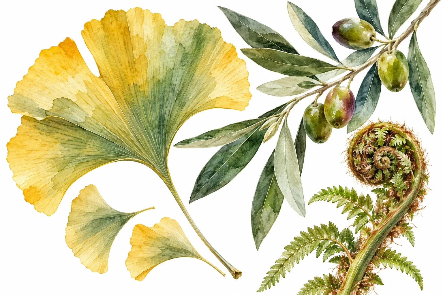
How to Paint Watercolor Leaves: Shape, Edges & Layering
Paint leaves that differ in shape and movement instead of repeating the same green symbol. You will connect observed silhouettes, brush pressure, and selective layers in a short study of three distinct leaves.
3 min read Read the lesson →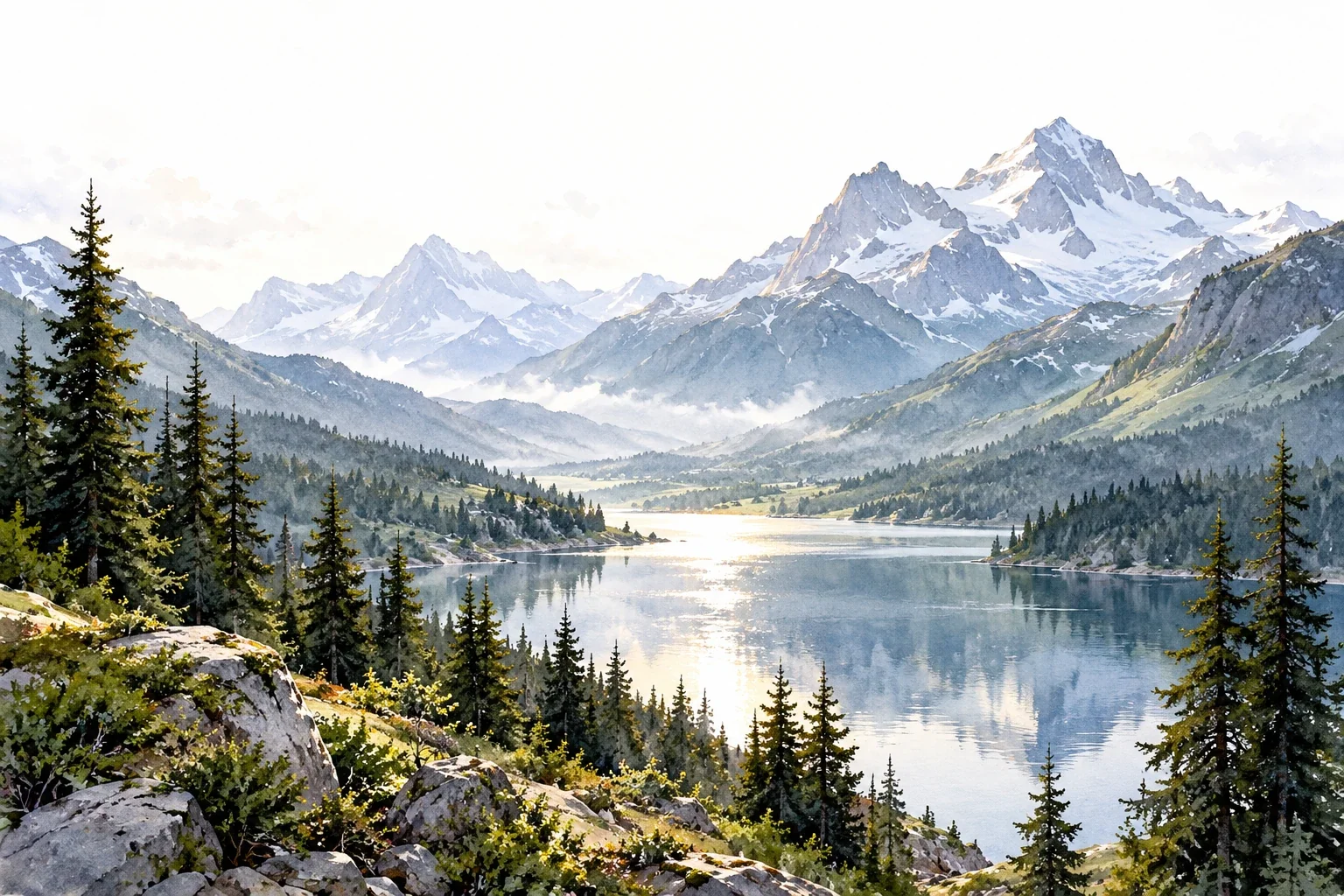
Creating Depth in Watercolor Landscapes
A landscape can look flat even when its individual trees and mountains are carefully painted. This guide shows how to organize depth through overlap, value, edges, and a focal area before investing time in detail.
3 min read Read the lesson →