
Coloring / Beginner
Color Flower Petals with Depth: Keep the Tips Light and the Overlaps Clear
Shade a simple flower coloring page through petal direction and selective overlap shadows instead of darkening every printed edge.
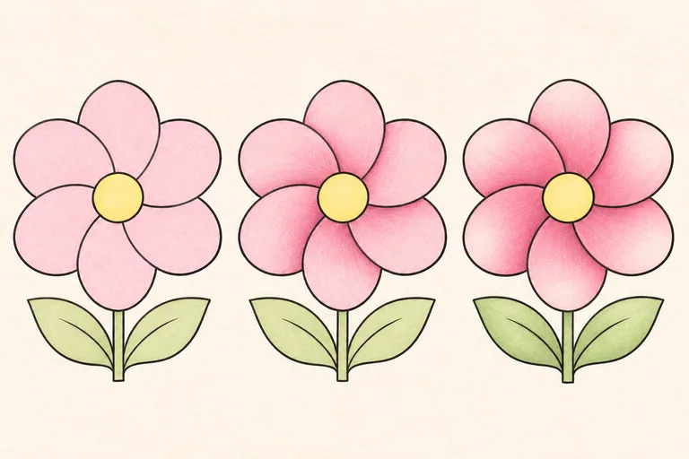
Read the flower before choosing more pencils
Start with one flower that has broad, readable petals. Identify which petals sit in front and which tuck behind them. Printed outlines can be decorative, so choose a simple interpretation when the design does not specify every overlap. You do not need to add veins to explain a flower that still lacks a clear light-and-dark plan.
Pick a pale base color, a middle color from the same family and a deeper accent. Pink, rose and muted burgundy can work, but use colors you already own. Keep a scrap nearby to check combinations. The flower above is an original illustrative example, not a reproduction of a specific printable page.
Preserve the lighter open areas
Choose a consistent light direction, or use a gentle simplified arrangement with lighter exposed tips and deeper tucked bases. Apply the base color lightly. Leave some paper visible near the broadest open tips so the flower has room to become lighter and darker without changing the printed contours.
Do not leave the same wide white stripe around every edge. That can make each petal resemble a cutout. Let the pale area follow the individual surface and keep some edges fully colored where that suits the form.
Shade in the direction of the petal
Use short, light marks that follow the petal from its base toward its tip. Broader open petals can take gentler overlapping strokes; a narrow folded section may need a more directed mark. Turn the paper to keep your hand comfortable rather than forcing every stroke in the same direction.
Faber-Castell's coloring guidance includes light-pressure shading and layering as useful ways to control colored-pencil areas. Here, apply the middle color only where a petal turns or tucks inward. Avoid giving all petals an identical gradient if their positions differ.
Make overlap shadows small and specific
Find an edge where a front petal clearly covers another. Place a restrained deeper accent on the petal underneath, close to that edge. Let it fade as it moves away from the overlap. The shadow belongs to the lower surface; it is not simply a thicker outline on the front petal.
Keep several other boundaries quieter. If every printed line receives the darkest pencil, the flower can look divided into tiles. A small number of strong overlaps usually explains more than a complete dark border around every shape.
Add the center and leaves without losing the hierarchy
Color the center as a clear small shape. A few darker dots or short marks may be enough if the design suggests texture. Keep their scale appropriate. Do not make the center so dark and busy that it hides the petal structure you have just established.
Give the leaves a related but quieter treatment. Use a pale green base and one slightly deeper area where a leaf turns or sits behind the flower. You can leave fine leaf details out. The exercise remains about petal form, not completing every possible surface texture.
Check the whole bloom before adding veins
At arm's length, look for a connected flower with lighter open areas and a few clear tucked overlaps. If one petal appears to have a hole in it, check whether the dark accent is too broad or disconnected from an edge. If the flower looks flat, adjust one overlap instead of darkening the entire bloom.
Try a second copy using the same palette but fewer shadows. Comparing the two can reveal how little contrast you need. If you want to add space around the finished flower, use the soft-background lesson as a separate next step.