
Coloring / Beginner
Color a Neon Night Scene with Alcohol Markers
Reserve a thin light core, surround it with controlled pink midtones and build a darker street around it to suggest an illuminated sign.
Start with an outline you can control
A neon sign reads as bright when a small pale core sits against a darker setting. You do not need a large marker collection or a complicated city scene. Draw a simple storefront, a blank rectangular sign frame and a strip of pavement, or choose a suitable scene you already own.
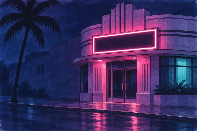
Use marker-compatible paper and linework that tolerates your markers. If printing, check both the paper's printer compatibility and the printed ink on a spare sheet. Protect the surface beneath from bleed-through and follow the marker manufacturer's handling instructions. The illustration is an AI-generated lighting reference, not a recorded marker test or a page included in the related workbook.
Plan the light, middle and dark zones
Choose a pale pink, a stronger pink, a blue-violet and a deep blue or navy. Test their dried appearance on the actual paper. Leave a very thin part of the sign frame uncolored as the light core. Place pale pink immediately beside it, then stronger pink farther out.
Keep the surrounding wall mainly blue-violet. Reserve the deepest blue for selected recesses, the interior of the blank sign and the palm silhouette. If the entire wall becomes pale pink, the light source loses its contrast. Mark your value plan on a small spare outline first.
Build a limited halo
Work around the reserved core carefully. Add a narrow pale-pink zone and then a slightly broader stronger-pink area where the light would reach the wall. Let the effect weaken as it moves away from the sign. You are suggesting light on nearby surfaces, not drawing an identical glowing border around every object.
Try overlapping adjacent marker strokes while the ink is still workable on your test paper. COPIC's gradation guidance provides a useful background for this. Your paper may spread or darken differently, so keep the halo modest instead of repeatedly saturating the same edge.
Color the night around the light
Fill manageable wall sections with blue-violet, keeping architectural boundaries clear. Darken the blank sign's interior so the reserved frame can read strongly. Preserve a few middle values on the doorway and facade; a solid black background can swallow useful structure.
Let pink touch only nearby surfaces that face the sign, such as an upper door surround or a projecting ledge. An unlit wall farther away can remain cooler and quieter. Keep one dominant pink source before attempting a second cyan light.
Place reflections beneath their source
On the pavement, add a loose broken zone of pink beneath the sign. Follow the ground plane and interrupt the color with darker gaps. The overall reflection can extend toward the foreground, but its separate marks should feel attached to the flat street rather than standing upright like another sign.
Use fewer and weaker reflected marks than the main light. Check the illustration for the broad relationship, then simplify it. You do not need to reproduce every patch or tile to communicate a damp pavement.
Stop before the reserved light disappears
Let the sample settle and inspect it at normal viewing distance. The sign should have the lightest thin core, a small colored surround and a distinctly darker setting. If the core has filled with ink, a colorless blender is not a dependable way to restore clean white paper. Try a fresh small study with a wider reserved gap.
For uneven large fills, use the separate streak-reduction exercise. To construct your own street outline, begin with the tropical perspective lesson. The related coloring workbook offers other scenes for practice; it is not a GTA-themed product.
This independent LUREXEN art lesson is not affiliated with or endorsed by Rockstar Games. The illustration is an original teaching example, not an official GTA VI image.