
Watercolor / Beginner
GTA 6’s Vice City Colors: Build a Tropical Art Palette
Turn an interest in Vice City’s tropical atmosphere into an original five-color study, with clear roles for warm walls, cool shadows and dark accents.
Observe the atmosphere before choosing paints
GTA 6 can be a starting point for looking more closely at tropical city color. Open Rockstar's official GTA VI page if you want the game context, then look for relationships: warm architecture against a cooler sky, small saturated accents and dark silhouettes. Choose one lighting mood rather than combining every bright color you notice.
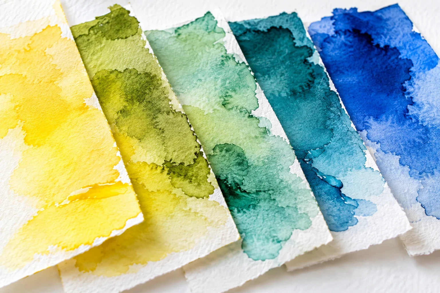
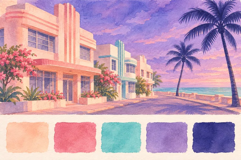
This lesson proposes a separate LUREXEN palette for an invented coastal street. The five swatches above are not official game colors, sampled RGB values or a pigment shopping list. You can complete the exercise with paints you already own, substituting similar warm and cool colors. Have watercolor paper, a brush, water, a mixing surface and a scrap of the same paper ready.
Give five colors five different jobs
Use pale peach for large sunlit wall shapes, rose-pink for a few warm accents, turquoise for a small sea or trim area, violet for the sky and broad shadow family, and deep indigo for selected silhouettes. These are color roles, not equal shares of the picture. Leave some unpainted paper as the lightest value.
Make five swatches and let them dry. Beside each, paint a lighter version using more water. A color that looks vivid on a screen may behave differently as a transparent wash. Judge your own dried samples before committing to a full scene; pigment strength and paper affect the result.
Plan three values before adding detail
Draw a tiny rectangle, about the size of a bank card. Place a low building mass on one side, a sky shape above it and one palm silhouette on the other. Keep the arrangement simple enough to read without windows or flowers.
Assign light, middle and dark areas. In this version, peach walls provide much of the light, violet supplies the middle range, and indigo occupies a small dark area. Squint at the thumbnail: the palm should still separate from the sky. If both have become equally dark, adjust the value plan before adding another hue.
Build a small original coastal scene
On a fresh rectangle, place the pale wall color first and leave a narrow light edge where it helps describe the building. Put violet in the sky or a separate shadow plane. Keep a turquoise accent smaller than either main color family so it has a clear purpose.
Add rose-pink to one or two features rather than outlining everything with it. Once the underlying paint is dry, use indigo for the palm trunk, a connected crown and a few necessary openings. Invent the building shapes; you do not need to trace a screenshot to practice these relationships.
Change the balance without changing the palette
Make a second thumbnail using the same five colors. This time, give violet more space and reduce the peach wall area. Keep one pale opening near the horizon. The mood can shift toward evening even though you have not added a new paint.
Compare the two studies side by side. Ask which color dominates, where your eye lands first and whether the darkest marks support that focal point. If every accent competes equally, remove one from the next version instead of making all of them brighter.
Keep a useful palette record
Write your actual paint names beside the dried swatches, including any mixture that produced a useful peach or indigo. Record one decision worth repeating, such as reserving turquoise for the water. Your record should describe your materials, not pretend to be an official game palette.
Use the same plan in the tropical sunset watercolor exercise, or switch medium with the neon-night marker study. Each exercise explores an original scene rather than reproducing a game asset.
This independent LUREXEN art lesson is not affiliated with or endorsed by Rockstar Games. The illustration is an original teaching example, not an official GTA VI image.