Watercolor / Beginner
Watercolor Agate Bands: Keep Pale Channels Between Uneven Rings
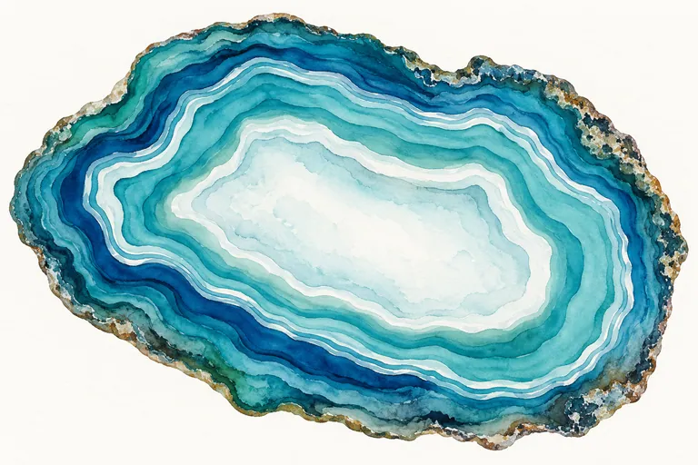
Paint a decorative agate slice with varied band widths, a quiet center and deliberate paper gaps instead of a stack of identical circles.
Begin with a band plan, not a circle template
An agate-inspired painting becomes more interesting when its rings do not behave like a target. Draw an irregular outer shape, then choose a few places where a band will widen, narrow or change direction. Let the center remain calmer than the rim. This is decorative mineral-inspired art; it is not a geological identification diagram.
Try a thumbnail first. Mark just three kinds of area: painted band, pale channel and quiet center. If every space has the same width, vary the plan before paint makes the problem harder to change.
Prepare two versions of one color
Use watercolor paper, a small round brush, a larger brush for the center and one blue or green color you enjoy. Make a pale puddle and a stronger puddle. A second related color is optional. Keep a scrap of the same paper ready for testing edge control.
The Transparent Watercolor Society of America explains the visual role of paper showing through transparent paint. Use that principle to plan light channels in advance. White paint is a valid material in other approaches, but this particular exercise explores reserved paper instead.
Work around the light
- Paint a loose outer band. Follow the irregular outline on dry paper. Vary the width intentionally rather than correcting it into a uniform strip.
- Skip a narrow channel. Leave paper visible before the next painted band. The channel may break or taper; it need not form a perfect continuous ring.
- Separate wet neighbors. If a clear gap is important, wait for the adjacent band to dry before approaching it closely. Test your brush on scrap to check how wide its mark becomes.
- Quiet the center. Use a lighter wash or leave a partly unpainted center. Reserve the busiest transitions for selected parts of the rim.
Turn the paper when it helps your wrist. Painting every curve from one hand position can make one side of the slice more awkward and much heavier than the other.
Add a rim without covering the band structure
When the main shapes are dry, place a few short, darker broken marks at the outside edge. Leave some stretches alone. A fully outlined, evenly dotted rim can overpower the transparent passages. Keep texture outside the most useful light channels so the value structure stays clear.
Do not treat the generated illustration as a color-matching target. Your pigment, dilution and paper may produce a different dry result. Judge whether the bands remain distinct and whether the center offers visual rest.
Troubleshoot on a spare strip
Bands merge: try the same two strokes farther apart, then closer together after the first dries. The slice looks rigid: change the spacing and outer silhouette in the next thumbnail. The middle is too busy: simplify the next center rather than adding more rings to balance it.
A useful second version
Make another small slice using the same palette, but group several dark bands on only one side. Compare it with the first after drying. Notice whether an uneven distribution of detail gives the eye a clearer place to begin.