
Watercolor / Beginner
Paint a Watercolor Holiday Card in Burgundy and Ice Blue
Try a seasonal color pairing with one painted ribbon, a pale blue accent and enough white space for a personal message.
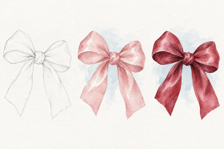
Test a different seasonal pairing
Burgundy and ice blue are one of the color pairings highlighted in Minted's 2026 holiday-card roundup. This practice turns that inspiration into a small original card: a single ribbon motif, a quiet blue accent and a clear space for your message. It does not reproduce a commercial card design.
You need watercolor paper, a pencil, a round brush and familiar red, blue and dark mixing colors. Use a flat piece of watercolor paper for the study. If you later want a folded card, choose suitable stock and test how it folds before painting the final version.
Mix swatches before the card
Mix a deep wine-red from the paints you own. A red with a little blue or another darkening color may move toward burgundy, but the result depends on the pigments. Add small amounts, test on scrap and stop before the mixture loses the character you want. There is no universal tube-color recipe.
For the pale blue, dilute a blue you like and compare it after drying. Keep it lighter than the ribbon so the bow remains the main subject. Test the two colors next to each other. Do not rely on your screen to predict their printed or painted appearance.
Give the ribbon a believable shape
Loosely tie a real ribbon or use your own photograph. Mark the central knot, two loops and two tails with light pencil. Let the loops differ slightly if your reference does. Check that the knot connects the parts rather than floating between them.
Keep the motif away from the paper edges and leave a generous area below or beside it for your message. A plain background makes the shape easier to read. You do not need a wreath, ornaments and snowflakes around the same bow.
Paint in a calm sequence
- Place the blue accent. Paint a light, simple wash near the ribbon area, leaving room for the message. Let it dry before nearby red marks.
- Add the ribbon's first wash. Use a lighter version of your wine-red mixture. Reserve small pale areas on the outward-facing curves.
- Let the bow dry. Test on scrap before adding another layer; the paper's drying time will vary.
- Deepen a few folds. Add short darker shapes beneath the knot and inside the loops where your reference supports them.
Canson explains glazing as applying a wash over a dried layer. Keep this second pass selective so the bow retains light areas rather than becoming one dark silhouette.
Finish without crowding the message
Allow the paint to dry fully before lettering. Test your chosen pen on a spare painted patch; some inks bleed or scratch over textured paper. Write your message where the paper is quiet. A brief personal line is enough.
If red spreads into the blue, compare a fully dried accent with your first attempt. If the bow looks flat, check the light and shadow shapes rather than adding an outline everywhere. If the card feels busy, remove an extra accent in the next version.
Make a second small study using the same mixture and a different ribbon angle. You can also compare this palette with the beginner Christmas-card ideas. This exercise is a way to explore a seasonal palette, not a guarantee of a particular result.