
Beginner / Original practice lesson
Easy Christmas Watercolor Cards: 3 Festive Designs for Beginners
Paint three elegant Christmas watercolor cards with evergreen sprigs, a glowing ornament and a snowy fir—simple seasonal designs built from useful brush skills.

The idea to understand
A handmade Christmas card works best when one clear motif has room to breathe. These three beginner-friendly designs reuse skills that matter beyond the holidays: tapered strokes, reserved paper, controlled washes and selective contrast. Paint a small material test first, especially if the card stock is unfamiliar.
What you need
Watercolor paper or blank watercolor cards, a pointed round brush, clean water, tissue, pencil, forest green, a cool blue, muted red and optional gold watercolor or gouache.
Your practice sequence
Prepare three card plans
Fold or trim three cards and mark a quiet margin in pencil. Assign one motif to each card: evergreen and berries, one ornament, and a snowy fir. Keep the main shape inside the middle two-thirds so it does not feel cramped after folding.
Paint the evergreen card
Use the brush point and a light pulling motion for a central twig. Add tapered needles in uneven groups, then place a few muted red berries. Let small paper gaps remain between greens. Avoid outlining every leaf or filling the whole card.
Build the ornament and fir
For the ornament, reserve one highlight and paint a round transparent wash, deepening the lower edge only after drying. For the fir, stack irregular green shapes from a narrow top to a wider base; add pale blue-gray shadow shapes around selected branches instead of covering every white area.
Finish with restraint
When everything is dry, add one or two dark accents and optional metallic details. Test metallic paint separately because opacity and scan appearance vary. Remove visible pencil gently, then check that each card still has one dominant shape and generous quiet space.
Check your result
Place the three cards side by side. Does each design read immediately at arm’s length? Are whites still clean? Is the darkest value concentrated near the subject rather than scattered everywhere? Choose the strongest card and write what makes it clearer.
If the study is not working yet
If the greenery looks stiff, vary needle length and spacing. If the ornament looks flat, preserve a larger highlight and deepen only one side. If the fir becomes muddy, wait for layers to dry and use fewer passes.
A useful second attempt
Repeat your strongest design in a limited two-color palette. Change the composition slightly, then compare which version feels calmer and more personal.
Further reading
Strathmore Artist Papers: Watercolor Postcards ↗. This is supporting reading; the exercise above is an original LUREXEN practice plan. Publisher images have not been reused.
An optional practice companion
Watercolor Skies & Clouds Workbook on Etsy ↗. The workbook is optional; you can complete this lesson without purchasing anything. Check the listing for its current contents and terms.
Continue with a related lesson
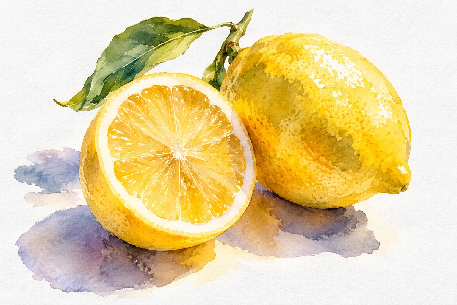
How to Paint Watercolor Lemons: Light, Layers & Shadows
Paint one small lemon to learn how light, transparent layers, and shadows work together. You will plan the highlight, build a rounded form, and avoid the two habits that often dull yellow: a crowded mixture and repeated brushing.
4 min read Read the lesson →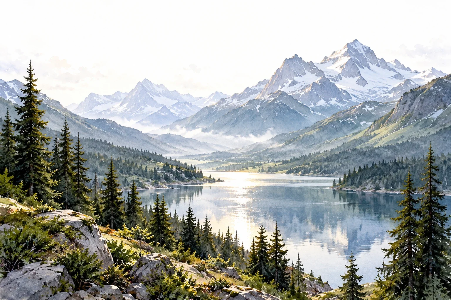
Creating Depth in Watercolor Landscapes
A landscape can look flat even when its individual trees and mountains are carefully painted. This guide shows how to organize depth through overlap, value, edges, and a focal area before investing time in detail.
3 min read Read the lesson →