Beginner / Christmas studio
Watercolor Christmas Robin: Soft Feathers and a Warm Red Breast
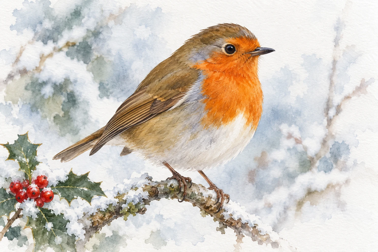
Paint a small winter robin with simple shapes, soft feather edges and a warm red breast. A focused watercolor exercise for handmade Christmas card ideas.
One focused seasonal study.
Keep the first attempt small enough to repeat. Your own subject, paper and materials are the reference.
- Level
- Beginner
- Practice time
- 30–40 minutes, plus drying
- Skill focus
- Shape relationships, restrained layering and varied edges
- Success looks like
- Paint a recognizable robin with a rounded body, a clear eye and a warm breast that stays separate from the pale belly.
Materials
- Watercolor paper and a scrap of the same sheet
- A pointed round brush, palette and clean water
- A familiar warm red or orange, yellow, blue and earth brown
- HB pencil, eraser and a cloth
- Your own robin photograph or another reference you have permission to use
Paint a recognizable robin with a rounded body, a clear eye and a warm breast that stays separate from the pale belly.
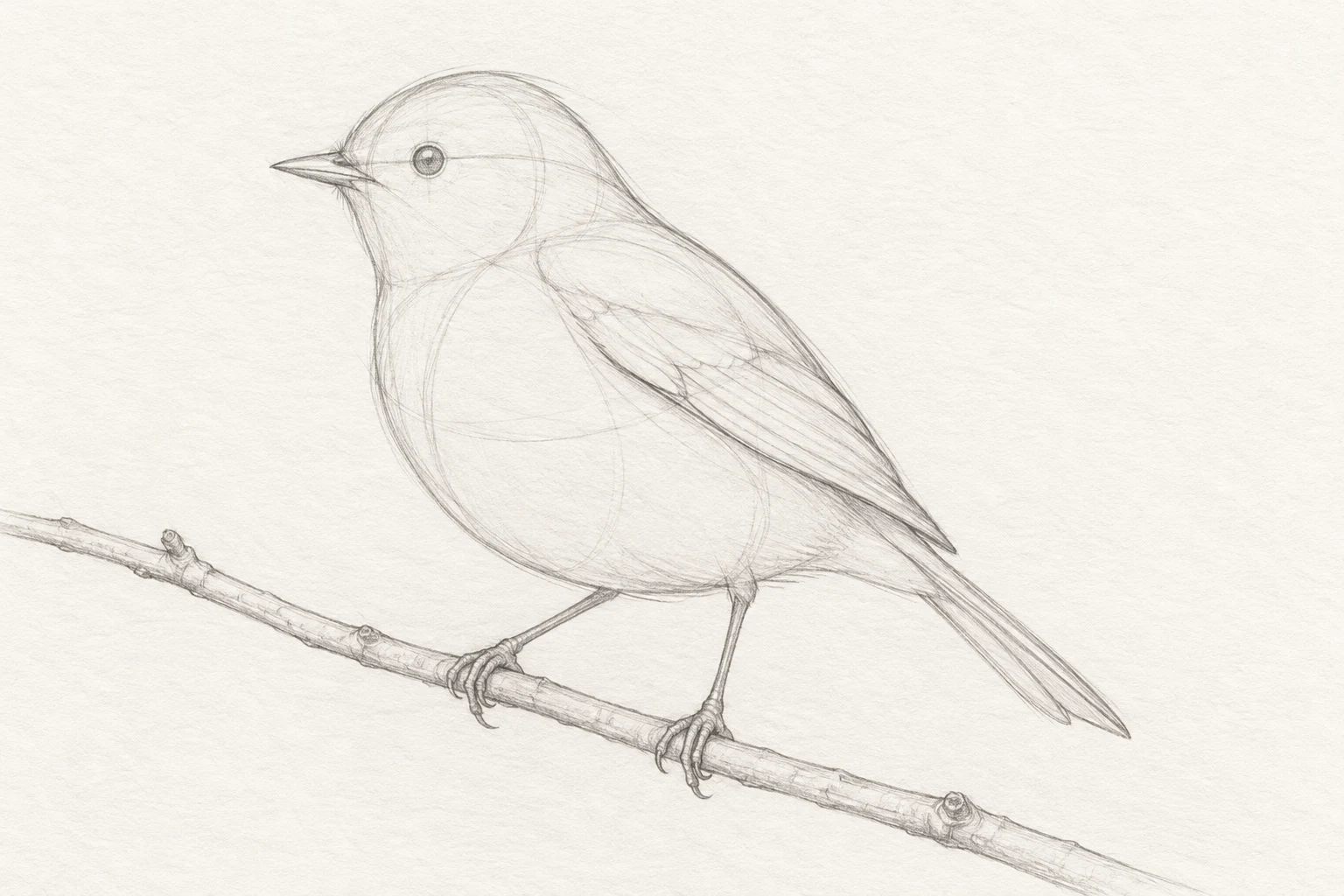
Find the bird inside two unequal shapes
Choose a side or three-quarter reference with an unobstructed head. Begin with a tilted egg shape for the body and a smaller rounded head. Compare their sizes before adding a beak. A robin's head should connect to its body without a long, narrow neck; look at the actual silhouette rather than joining two perfect circles.
Place the eye, short beak, wing and tail lightly. Check the distance from the eye to the beak against the head width. Mark the perch and two small feet, but postpone claws and feather patterns. For this exercise, keep the bird roughly palm-sized so you can repeat it without committing to a large painting.
Separate the breast, belly and wing before color
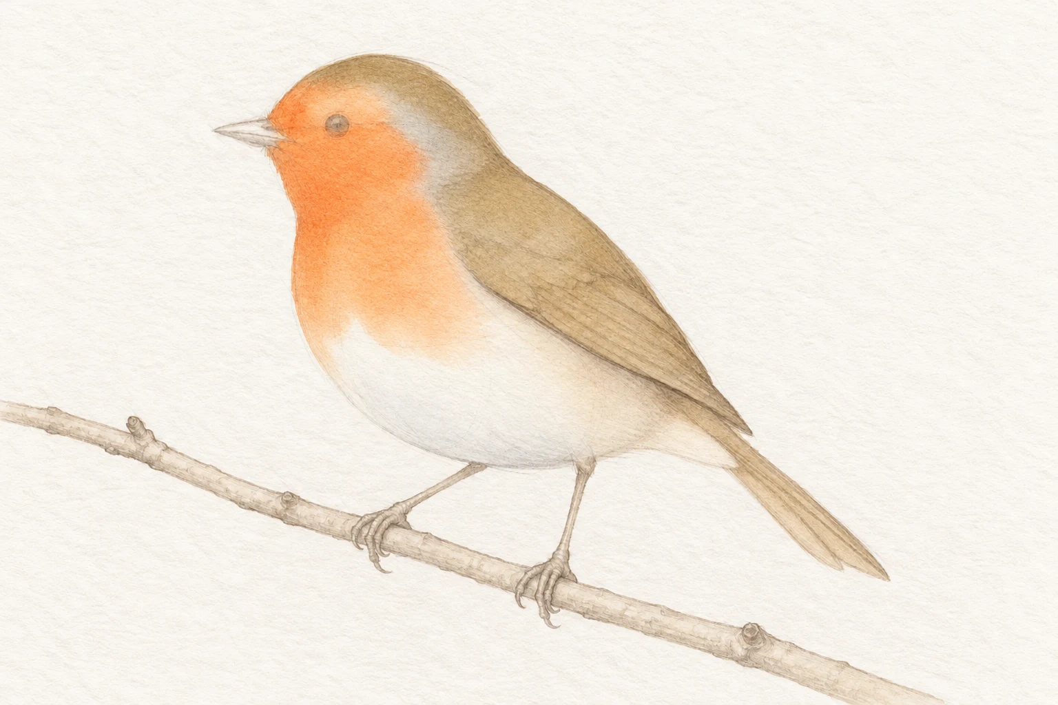
Lightly locate the warm face-and-breast area, the pale underside and the brown back. These are connected color regions, not shapes to enclose with dark outlines. Leave enough pale belly beneath the warm breast. A red oval placed too low can make the bird look like an ornament rather than a living form.
Make three scrap-paper tests: a diluted warm breast color, a quiet brown for the back and a very light cool gray for the belly. Let them dry. Keep the gray noticeably lighter than the brown. Mix from your own pigments; color names and mixing ratios cannot guarantee the same result across different paint sets.
Lay in the light colors without chasing feathers
Start on dry paper with the diluted breast mixture. Work within the warm region, leaving the eye area legible. Where you want a softer transition into the belly, touch the edge with a clean, damp brush while that small passage is still workable. Test the brush moisture on scrap first: a dripping brush can push paint into an unwanted bloom.
Paint a pale brown back and wing, avoiding the still-wet breast unless you intentionally want a mingled edge. Suggest the belly with a little cool gray near its lower turn, preserving much of the paper. Leave this first pass alone until it is fully dry. The purpose is a coherent bird-shaped wash, not a finished collection of feathers.
Round the form with selected second passes
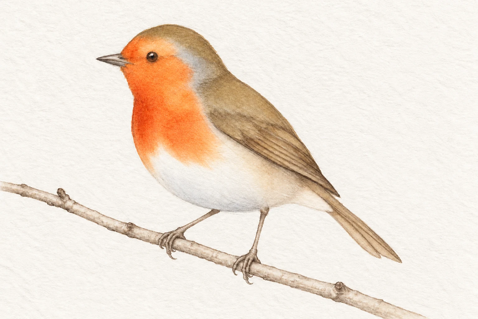
Test a second transparent pass on your scrap swatch before touching the bird. Add a slightly deeper warm color to part of the breast's lower or side edge, keeping a lighter area toward your chosen light. Stop before every warm passage becomes equally dark. In transparent watercolor, another layer changes both the color and the value underneath it.
Use a few darker brown marks to explain the wing fold and the separation between wing and body. Follow the broad direction of the feather groups rather than drawing a net of individual lines. If an underlying wash starts moving, stop brushing, allow it to dry and reassess. Extra scrubbing rarely makes this small study clearer.
Choose a few crisp accents and a quiet perch
When the surrounding paint is dry, add the small eye and short beak with a pointed brush. Keep any eye highlight tiny and subordinate to the eye itself. Reinforce only the details that help recognition: a wing edge, a tail division and the feet connecting to the twig. A continuous hard outline around the whole bird can flatten its softness.
Paint a simple twig and leave a broken light strip if you want a snow suggestion. Keep decorative berries away from the bird's eye so they do not compete with the focal point. If using the study on a card, reserve a clear space for a greeting from the start. This lesson is a painting exercise, not a full-size printable card template.
Compare two studies before adding decoration
Repeat the bird on a second small piece of paper, changing only one choice: a lighter first wash, a larger pale belly or fewer feather accents. Compare the two from arm's length. Which reads as a rounded bird before you notice the small details? Put a short note beside that study explaining the decision that helped.
If the drawing feels wrong, compare the head-to-body relationship before repainting. If the color looks heavy, use a lighter first pass next time. If the surface looks busy, remove planned marks rather than adding more. A useful Christmas practice session ends with an observable improvement, not necessarily with a finished card ready to give away.
Change one decision, not everything.
Common mistakes
The bird looks like two disconnected circles
Recheck the head-body connection and soften the neck silhouette in your next sketch.
The belly has disappeared
Reserve a larger pale underside and keep its gray wash light.
Every feather is outlined
Describe the wing with a few grouped marks and retain quiet areas.
The second pass disturbs the first
Test layering on scrap, let washes dry and avoid repeated brushing.
Think it through
Try answering these questions in your own words, then open each answer to compare. Use the self-check below to review your actual study.
Why plan a pale underside before painting the breast?
Lightly locate the warm face-and-breast area, the pale underside and the brown back. These are connected color regions, not shapes to enclose with dark outlines. Leave enough pale belly beneath the warm breast. A red oval placed too low can make the bird look like an ornament rather than a living form.
Practice step: Separate the breast, belly and wing before color
When should I add the small eye and beak?
When the surrounding paint is dry, add the small eye and short beak with a pointed brush. Keep any eye highlight tiny and subordinate to the eye itself. Reinforce only the details that help recognition: a wing edge, a tail division and the feet connecting to the twig. A continuous hard outline around the whole bird can flatten its softness.
Practice step: Choose a few crisp accents and a quiet perch
Review your own study
Tick what you can observe in your work. If a point is unclear, open its practice reminder. Choose one point to focus on next.
Tick a point only when you can observe it in your study.
Choose one focus for your next attempt using the circle beside a point.
This is your own reflection, not an assessment of your artwork. Choices are not saved or uploaded and reset when this page reloads.
Further learning and source context
This is an original LUREXEN exercise. These references support the general technique or subject context; they do not document the exact illustrative studies pictured above. No publisher artwork was reused.
Turn a small study into a card composition.
The Christmas Cards workbook is an optional 45-page companion with six guided card projects. The free lesson above stands on its own; you do not need a purchase to practice it.
Explore the Christmas Cards workbook →