
Intermediate / Original practice lesson
Negative Painting in Watercolor: Reveal Ferns by Painting Around Them
Create a small layered fern study by deepening the spaces around the fronds instead of drawing every leaflet with a dark line.
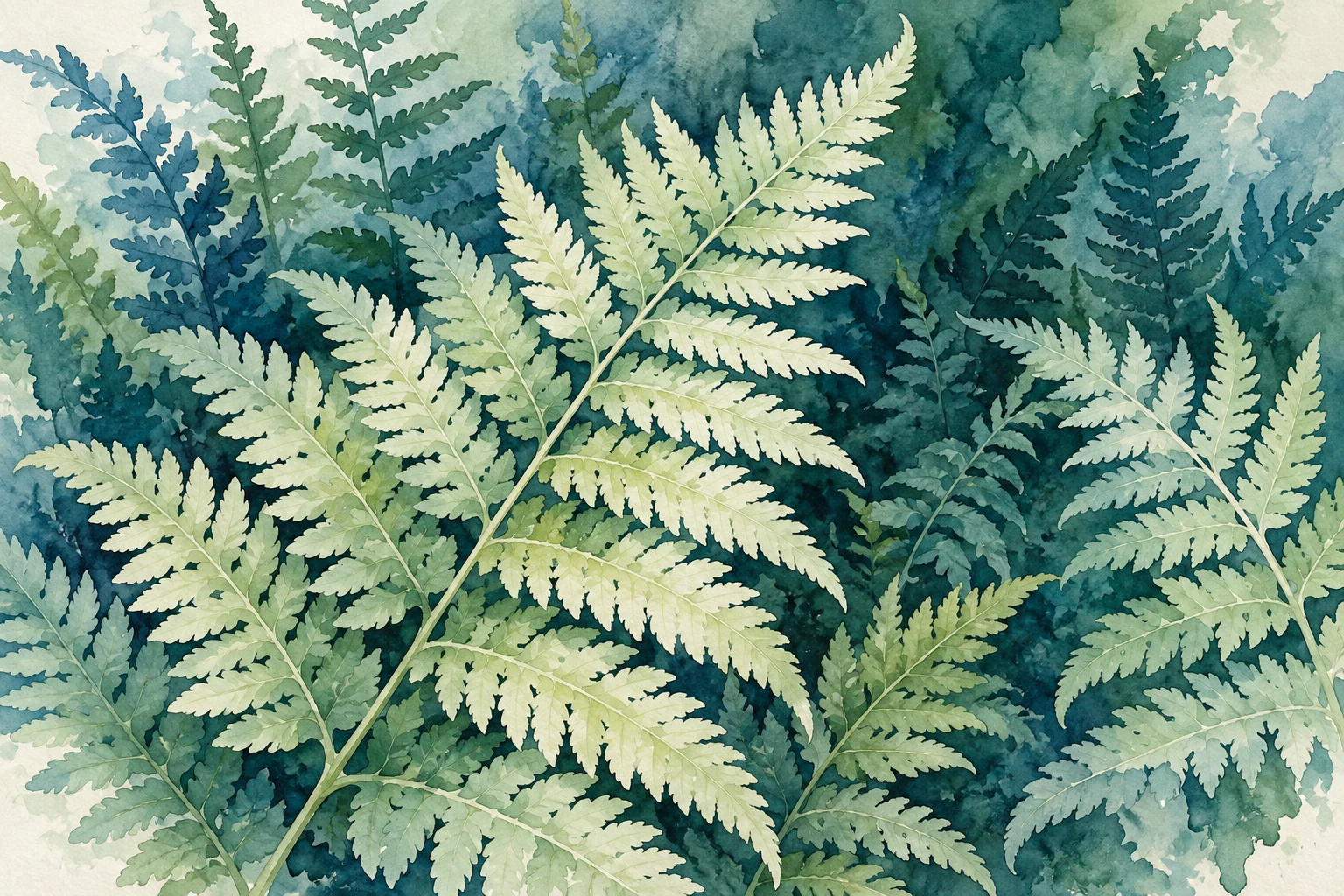
The idea to understand
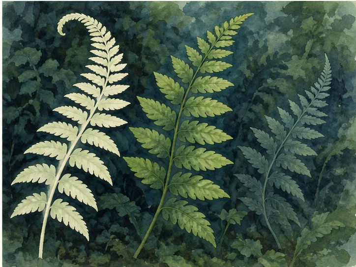
Negative painting defines a subject through the shapes beside it. In this exercise, a pale frond remains light while the spaces around it become darker. The method rewards a clear silhouette plan more than hundreds of tiny details. Treat the first study as a composition of three fronds, not a botanical inventory.
What you need
Watercolor paper, pencil, a pointed round brush, a larger wash brush and a limited transparent green-blue palette.
See the study develop
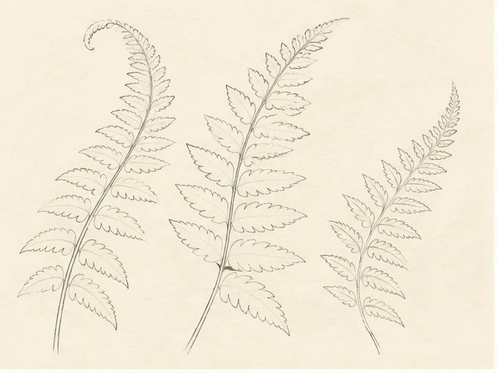
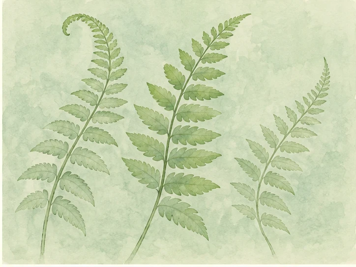
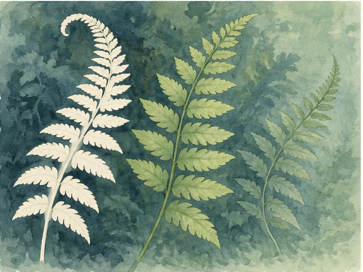
Four original AI-assisted illustrative stages, not photographs of a recorded demonstration. Compare the changing shapes and values; use your own observation and material tests.
Your practice sequence
Simplify the fronds
Sketch three curved stems with different heights. Indicate the overall taper and a few paired leaflets. Choose one foreground frond to remain lightest. Make the gaps large enough to paint with your brush; microscopic spaces invite fussy corrections.
Establish a pale field
Cover the rectangle with a gentle blue-green wash and let it dry. This wash becomes the lightest frond color, so keep it pale. Save a small strip of the wash on scrap paper as a value reference.
Paint the spaces
Paint around the first frond, joining adjacent background areas instead of outlining each leaflet separately. Leave its silhouette untouched. Dry the layer. In the next pass, preserve both the first frond and a second frond while deepening only the remaining spaces.
Choose the deepest pockets
Place the darkest accents in a few gaps near the focal frond. Do not darken every opening equally. Suggest one or two stems only where they help the structure. Leave some peripheral shapes less explicit.
Check your result
Can you distinguish three depth groups without reading individual leaflets? Is the lightest frond still intact? Does its silhouette taper naturally? Look at the painting small: a clear large shape matters more than decorative complexity.
If the study is not working yet
If all fronds merge, separate their values before adding veins. If gaps look like dark outlines, connect larger surrounding spaces. If paint bleeds into a reserved shape, check the moisture and practice that edge on scrap paper.
A useful second attempt
Make a second study with wider spaces and fewer leaflets. Compare which version reads better at thumbnail size.
Further reading
Louise De Masi: negative painting demonstration ↗. This is supporting reading; the exercise above is an original LUREXEN practice plan. Publisher images have not been reused.
An optional practice companion
Botanical Watercolor Workbook on Etsy ↗. The workbook is optional; you can complete this lesson without purchasing anything. Check the listing for its current contents and terms.
Continue with a related lesson
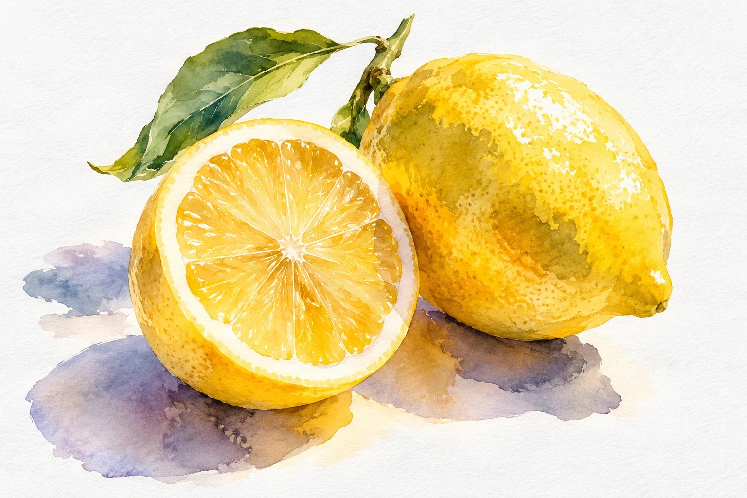
How to Paint Watercolor Lemons: Light, Layers & Shadows
Paint one small lemon to learn how light, transparent layers, and shadows work together. You will plan the highlight, build a rounded form, and avoid the two habits that often dull yellow: a crowded mixture and repeated brushing.
4 min read Read the lesson →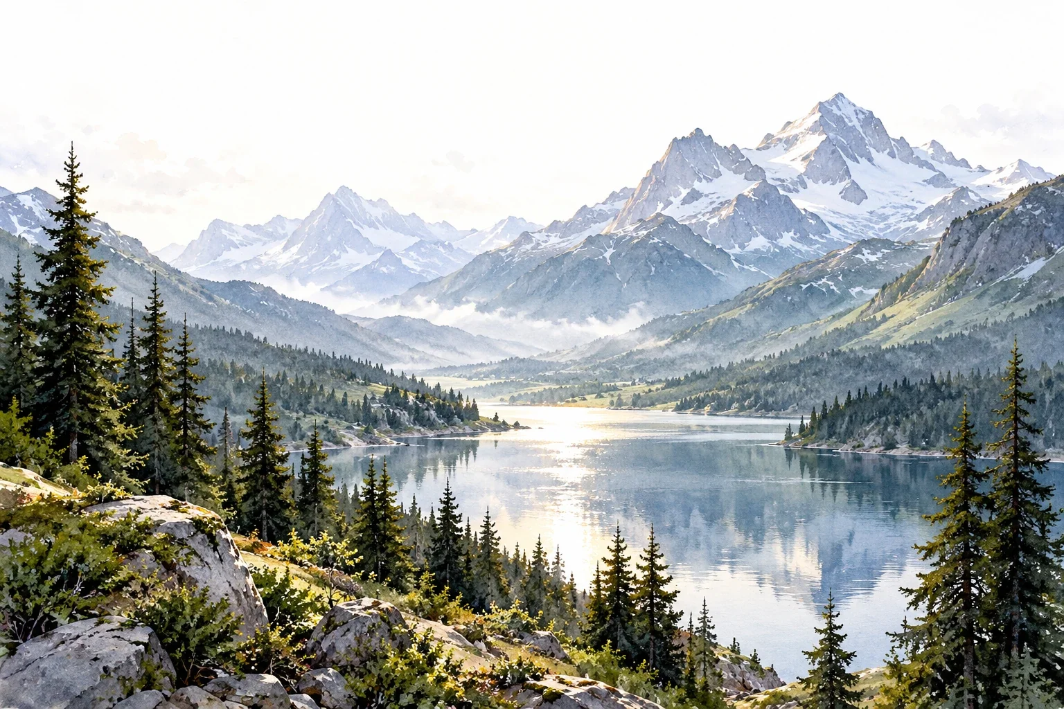
Creating Depth in Watercolor Landscapes
A landscape can look flat even when its individual trees and mountains are carefully painted. This guide shows how to organize depth through overlap, value, edges, and a focal area before investing time in detail.
3 min read Read the lesson →